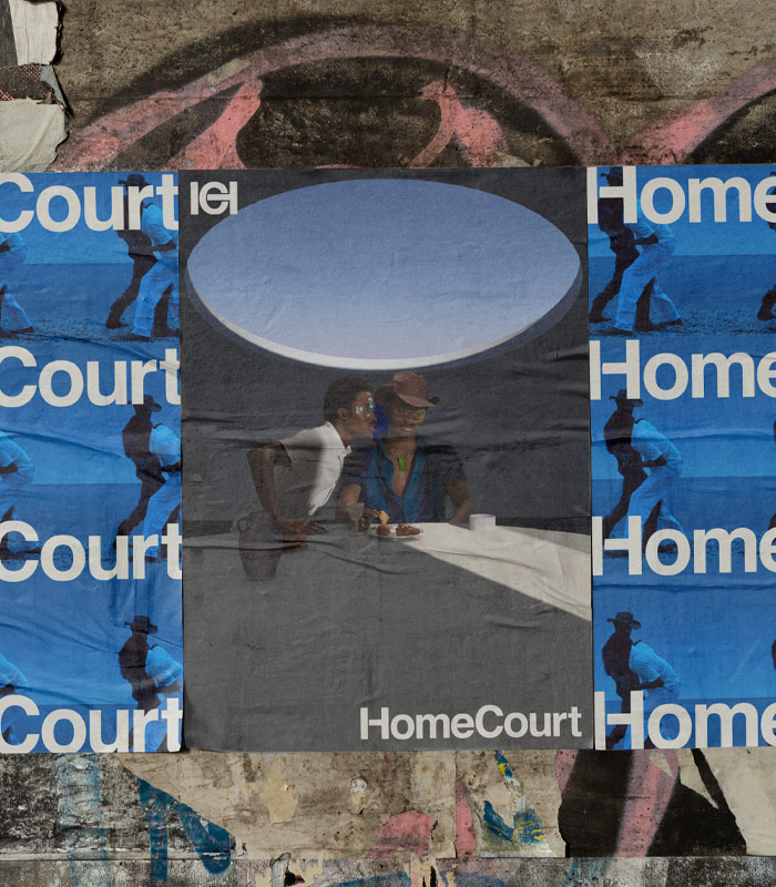

homecourt
design
launch
where culture meets creativity
Located in the heart of Toronto’s dynamic Ossington neighbourhood, HomeCourt supports the next generation of artists, brands, and creators. We established an identity that brought the intersections of culture and creativity to life, inspiring them to use and transform the space’s blank canvas.

pulling inspo and making it pop

crafting an iconic wordmark
Neue Haas Unica was the starting point for our wordmark and icon. To create a bold, stable icon, we stretched and overlapped the H and C of HomeCourt, a reflection of the space as a blank canvas for creatives to mold and make their own. This icon is expanded into a high-fashion-inspired monogram used across the space and merchandise. Alongside oversized typography, HomeCourt’s distinct system of wordmark, icon, and monogram speaks to the audaciousness the space brings to Ossington.